

Showing posts with label Evidence 18. Show all posts
Showing posts with label Evidence 18. Show all posts
Tuesday, March 22, 2011


Monday, March 14, 2011
Writing the reviews
When writing the reviews for our magazine article we had to both keep the the stereotypical style of writing that is used within empire magazine which is discussed on my post film review analysis along with the demographics of the target audience that 'Empire' magazine is aimed at.
We also had to write the reviews with the audience feedback in mind which we acquired through our questionnaire. We analyzed the information and the results can be seen upon Blaine's post Quantitative feedback.
To view the review that I wrote in the style that empire magazine uses follow the link below:
Blaine has done a post exhibiting the reviews that he wrote and the construction process along the way.
 To view the two reviews that Blaine created and the process of writing them follow the link below:
Saturday, March 12, 2011
Qualitative feedback poster and Review
Feedback is a vital part in ensuring you have created a product that the consumer desires and that your product full fills this niche. In order to be sure that we have succeeded this, we acquired feedback through a mixed age range from our target audience to give us a great range of answers to our questions.
We interviewed six different people and they gave a range of answers both positive feedback and some constructive changes that could be made.
I have posted three out of the six videos below:
The questions we asked we both about the content of the subsidiary products but we also asked questions about the what would be the best place to exhibit both of them. Obviously our magazine review page was already going to be exhibited within empire magazine, but we had an empire magazine there which enabled us to ask questions involving the layout and tone of the review to find out if we had done our job and both written in the style that empire use as well as making our page look like an empire feature.
Magazine and poster feedback 1 from Tom palmer on Vimeo.
Magazine and Poster feedback 3 from Tom palmer on Vimeo.
The questions we asked we both about the content of the subsidiary products but we also asked questions about the what would be the best place to exhibit both of them. Obviously our magazine review page was already going to be exhibited within empire magazine, but we had an empire magazine there which enabled us to ask questions involving the layout and tone of the review to find out if we had done our job and both written in the style that empire use as well as making our page look like an empire feature.
The feedback was very good and we acquired a lot of potential information we could use when exhibiting our products an which places were best to do so.
We also asked questions involving what their expectations were after looking at the poster and we then asked similar questions after they had watched the film to find out if they thought the poster gave the right connotations or wether they thought they had been misled.
Over all the feedback session was great and both myself and Blaine learned a lot from the feedback and could adjust the products with their constructive criticism comments if we felt it necessary.
Thursday, February 17, 2011
Penumbra, Short review construction
After Blaine analyzed the results to the questionnaire that we created. I have a great understanding of the content that is needed within our review as well as the layout that people mostly desire. Blaine originally created a potential layout for our magazine but since then we have been discussing the layout and I have researched a lot into the language used within the Empire magazine which can be found within my post Film review analysis as well as the typical layout that is used including unique elements and their demographics.
With images from the actual film, the film release date and a clearly defined rating of the film all ranking in the top answers of our questionnaire, these elements will defiantly be included. Results also showed, two other popular selections were comparisons to other films and an unbiased perspective, which myself and Blaine may include. 
These elements both within the content of our review and concerning the layout have been created below in the ongoing construction of our review:
This is my initial drawing of the layout used within Empire magazine with the elements that they use upon most of their review pages. For example the black lines to give the sense of a boarder upon the top and the bottom, this is also achieved with the dots that they use to break up each review and use them as a border around each review and images. Empire also use yellow lines/boxes at the start of each small review with the vital film information next to it that the reader desires.
It is easy to re-create the black boxes as they are black, but all the other elements that are included within the page have to be researched. I have done lots of research into the Fonts that they use, the text size, the colouring of the dark green titles and the colouring of the dark yellow boxes. I searched multiple websites, read multiple back pages of different empire magazines but there is no reference to the colours and fonts that they use. This was initial very annoying but I played around upon Microsoft Publisher and tried to re-create the colours that are used and tried to find the nearest font.
Here is a picture of the stereotypical Empire magazine layout of a review review page used for smaller multiple reviews which I based my drawing on above:

After researching and then trying to mimic the nearest possible colours and fonts I began to construct our review page which would be a new feature promoting short films and a competition to enter.

Above is a picture showing the creation of our film review page and I was trying to re-create the elements that are used. I created the black line/box which is used as a visual border on the page and defines the layout.
Empire is sponsored by Jameson and they are their main sponsor which usually cover new features that are introduced to the magazine. Because myself and Blaine are creating this review page based on a new feature introduction I thought it would be very professional to include their sponsors logo and gives the review a sense of continuity alongside the other visual elements that are included.

After finding the Sponsors logo and recreating the visual boarder, I started to design the page layout from an existing page but changing the elements and the content. I am trying to re-create the colour scheme that is used with a very dark green/blue as the titles and sub-titles with the lines acting as boarders and the dark yellow with the review information boxes.

Above is a picture of the ongoing construction of the review page and both myself and Blaine are currently writing reviews in order for me to then try and fit everything on the page in a neat and orderly fashion and overall making our review look exactly like it is a new feature within the Empire magazine because this is where our review is featured. It is very hard to find out the actual font and text size that empire use as well as the colour schemes but i am trying to re-create them as much as possible.
When to final review is finished and the layout is perfect I will post a link below which you can follow to view our final product of the subsidiary task, creating a review:
Monday, February 7, 2011
Out with the old and in with the new and improved poster
Both myself and Blaine discussed the film poster and after Blaine created a mock up of our initial poster idea which overall looked extremely unprofessional and did not in anyway shape or form get the audiences attention for the right reasons, apart from, that looks so rubbish I will point and laugh.
Blaine was unhappy with the outcome and decided to share his thoughts with me over the phone because I hadn't seen it yet. I trusted his judgement and he told me a new idea he had so after a long discussion (good thing I'm on contract) I said I would draw up some mocks of the new poster idea and below are two ideas that I envisioned from Blaine's explanation.
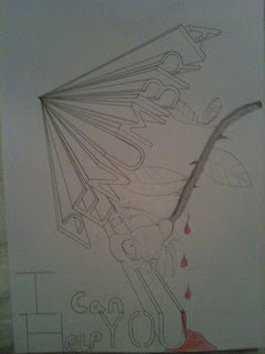

We then meet up the next morning for our three hours of media and exchanged more ideas. Blaine then set about the construction of our final poster with me on the sideline offering assistance and feedback, both positive and negative which we then discussed and compromised on certain features. Overall the poster looks great and I am happy that our first idea didn't work because I think that our new and improved version is much more interesting. Not only this but after reading the analysis of our qualitative questionnaire which wasn't available on the construction of our first poster, the three main features that our target audience wanted the poster to include were an eye-catching image, image of the main character and a catchy tag-line. Out of the three I think we have included a catchy image in the sense of the title, the layout of the multiple Penumbra titles with the images behind them are very eye-catching in my opinion but I will create a small feedback session for people to comment on the poster to finalize my oppinion. we also included a picture of the main character but not only this we included the forth most favorite answer within our questionnaire, which was a sense of mystery. This is also included because you cannot she the face of the main protagonist, even more than that, you do not know who or what his relationship is to the film is. His face can be seen within one of the Penumbra titles, but this still adds a sense of mystery because myself and Blaine know this but a random consumer of the poster will not. We didn't include a catchy tag-line because however much we tried to think of one which was ambiguous but not cheesy we couldn't decide on a final one. An idea was 'I can help you' but we decided that we wouldn't include this or any tag line because it is very risky in the form of being judged and criticized.
Blaine was unhappy with the outcome and decided to share his thoughts with me over the phone because I hadn't seen it yet. I trusted his judgement and he told me a new idea he had so after a long discussion (good thing I'm on contract) I said I would draw up some mocks of the new poster idea and below are two ideas that I envisioned from Blaine's explanation.
We then meet up the next morning for our three hours of media and exchanged more ideas. Blaine then set about the construction of our final poster with me on the sideline offering assistance and feedback, both positive and negative which we then discussed and compromised on certain features. Overall the poster looks great and I am happy that our first idea didn't work because I think that our new and improved version is much more interesting. Not only this but after reading the analysis of our qualitative questionnaire which wasn't available on the construction of our first poster, the three main features that our target audience wanted the poster to include were an eye-catching image, image of the main character and a catchy tag-line. Out of the three I think we have included a catchy image in the sense of the title, the layout of the multiple Penumbra titles with the images behind them are very eye-catching in my opinion but I will create a small feedback session for people to comment on the poster to finalize my oppinion. we also included a picture of the main character but not only this we included the forth most favorite answer within our questionnaire, which was a sense of mystery. This is also included because you cannot she the face of the main protagonist, even more than that, you do not know who or what his relationship is to the film is. His face can be seen within one of the Penumbra titles, but this still adds a sense of mystery because myself and Blaine know this but a random consumer of the poster will not. We didn't include a catchy tag-line because however much we tried to think of one which was ambiguous but not cheesy we couldn't decide on a final one. An idea was 'I can help you' but we decided that we wouldn't include this or any tag line because it is very risky in the form of being judged and criticized.
The last inclusion within the poster was the names of the main actors and directors upon the poster at the bottom which Blaine researched and found a font online which was very similar to the actual movie font that is used but free of charge. He found and installed a font called 'Rothman' which looked very authentic and works well upon the poster.
To view the all most finished poster with just some minor adjustments the poster is provided below:

Wednesday, February 2, 2011
Quantitative feedback analysis Blaine's blog
Both Blaine and I constructed a questionnaire to acquire information about potential consumers demographics which will help us to understand where we could advertise our short film, but as well as just finding out about their demographics we asked very guided questions about our subsidiary products, which would then help us within the construction process of both our poster and review. After analyzing the questionnaire results, the graphs show specific elements that consumers want to be included within these subsidiary products.
Blaine has provided some evidence of the results and analyzed what we have concluded from them.
 To view Blaine's post follow the link below:
http://blainekenneallya2media.blogspot.com/2011/02/quantitative-audience-research-analysis.html
Friday, January 14, 2011
Initial poster and review layout plans
Blaine has produced some drafts of some potential posters that we could use and he has also created a layout of a two page spread within a film magazine which we could place our review on. Because mainstream magazines do not really have reviews of short films unless they are very critically acclaimed. To read Blaine's post with detailed explanation of our choices follow the link below to his blog.


Wednesday, January 12, 2011
Classic movie posters and designers
Because we have to create a movie poster I thought it would be good to look at some classic movie poster and their designers.
Posters have been a strong form of advertising that many companies have adopted through the history of film production and advertising. There are many different aspects of a poster that can catch the eye of the consumer or intrigue them into the search to find out more.
The construction of a poster is not a simple task, there would be many people from a creative background, technical support and creation of the poster, researchers, Drawing artists and manager making sure that everything was above board and no rules and regulations were broken. This restrictions are a lot tighter to date but greater technology has been developed, bigger budgets are available consumer culture has changed and this has overall stemmed to new ways to advertising your film and make consumers aware of your product.


These very classic posters are just a small example of the wide range of posters that people created and how they connect with their target audience.
The E.T. and Blade runner posters were both created by John Alvin a very respected poster artist and has worked on over 200 posters.
The Clockwork orange poster was created by Philip Castle and many interpretations have been formed about the meaning behind he poster and this just shows the impact a poster can have upon your audience.
The Eraserhead poster created by Ben Barenholtz and director david lynch is just an example of how simple but effective a poster can be depending on your target audience and what you as the producer want to convey.
Marketing strategies have changed dramatically through the years but film posters still stand strong. Modern Posters have an exceptionally high standard and reputation for being extremely enticing with amazing concept art and stunning visual pleasures but at the other end of the spectrum they can also be very simple and very ambiguous. Many films do not just produce one poster anymore they create and original poster for the film but as the release date slowly becomes closer they release substitute posters creating world wide interest within audiences and build the excitement up until the release date.
I have found a really good website that hosts many images of posters called http://www.impawards.com/ and for some great examples of films that create more than one poster to create excitement within the potential consumers follow the links below for Inception and Tron Legacy which have over 15 exceptional posters each.
http://www.impawards.com/2010/inception.html
Thursday, December 16, 2010
Film review analysis
After reading reviews for the social Network a recently released film directed by David Ficher in both 'Empire' magazine and 'Total film' magazine, I have gathered an idea of the underlying tone of each review and the individuality of them both making each magazine distinct from each other and this helped me to gain ideas and an understanding of how to write a review catered for your target audience. 

The demographic side of the target audience for Total film magazine is much the same as Empire, but the tone of the review is very different. Reviewer: Damon Wise of Empire, creates an extensive review of The social network giving detailed information about the film/actors and director whilst not telling the story. His thoughts and opinions are made aware and Reviewer Andy Lowe of Total film in my opinion is very biased in his opinions leaving little room for others to make their own decisions, this can be seen by many as a good quality as this is a man that lives and breaths film so his opinions must be extremely valid but others may say that it effects peoples own judgement and leaves no room for their own conclusion. The review is much shorter and does focus upon the narrative, telling it a bit too much in my opinion but others may disagree. Total film also uses film terminology and does not use any witty language like Empires review includes.

The target audience of Empire magazine is predominantly male orientated between the ages of 16-30. The reasoning for such a wide range of target audience is that many reviews are writing based rather than picture led , this means that many younger readers can see the well chosen cinematic images and read the review and star rating to then come to their own conclusion about a film which is great but the detailed reviews that present a stream of consciousness style of writing focus upon the film using complex film terminology that not any movie lover and teenager would understand, it gives very detailed and accurate information on actors and directors also touching of their past films when mentioned comparing and contrasting them giving the audience an overall picture of the film and how it is compared to some of the directors/actors other films which then enables the reader to make self generated connections and opinions on how good the film will be if they have seen the films that are referenced.
Now to focus on the demographic side of the target audience we have already established the age range but I believe that the audience fits into the B,C categories of the Acorn system and that they would be reasonable upper class with disposable income to spend on luxuries such as a £3.99 film magazine for personal enjoyment as well as guidance on what films to see in the cinema (another luxury) or DVD to purchase (another luxury).
Total Film:
Overall these two reviews offer a different style in writing that myself and Blaine can use as example when writing our review. The variation also gives us many different ways we can write but we want to find out which style of writing our target audience would prefer before we construct the review.
Subscribe to:
Posts (Atom)