Showing posts with label Evidence 28. Show all posts

Thursday, March 24, 2011

Monday, March 21, 2011

Qualitative Feedback, main short film

In order to get the best product possible feedback is a must.
We had finally finished our production and was very excited to show it to some potential consumer for the first preview of our short film Penumbra.

Penumbra Audience feedback from Tom palmer on Vimeo.

Before we showed the video to them myself and Blaine had written down some questions that we wanted to ask the audience to acquire useful information when exhibiting our product but also finding out about our target audience, if we had correctly targeted our film and if the content fulfilled the needs of this audience.

Because the film is very much inspired by David Lynch with very interesting visual signifiers posing complex questions within the audience that are not always that easy to follow, we wanted to find out if the audience could follow the narrative and if they couldn't, were they the active consumers that we correctly targeted our film at, making them want to discuss the film with others to swap ideas trying to deconstruct and follow the film. This would then come under the two step flow categorization of audience that myself and Blaine wanted to target and you can view my analysis of this target audience if you follow the link below:

Research into target audience

Overall receiving feedback on our film was a great way in overall analyzing if we had accomplished our goal and made a film suitable for its target audience fulfilling a niche within the market.


Friday, March 18, 2011

The finished review

After the review was finished I brought it into school and myself and Blaine went through it thoroughly and corrected any spelling mistakes, changed a couple of the sentence structures and added and took away parts of the review layout and border where necessary.
To view the construction of the review follow the link below:
After we made these tweaks, we printed the final review out and decided to get some market testing and asked some questions surrounding the review and poster to potential consumers within the categorization of our target audience.
This is the review that we previewed to them and you can see their comments on my other post... Qualitative feedback poster and review
After both Blaine and I had a discussion involving their comments we made any necessary changes and here is the final review page below:

Wednesday, March 16, 2011

Internal monologue Blaines blog

Blaine is somewhat a Shakespeare of today's society, with his very elaborate and extensive range of vocabulary backed up by his some what baffling knowledge we both agreed that he would write the internal monologue script. we both discussed what we wanted the monologue to give to the audience and Blaine then went away and wrote some potential lines for each scene.

Like Blaine said within his post we didn't know how it would sound until we were there watching the film and listening to the monologue but because we had planned everything to a fine detail, the final product sounded great. To view Blaine's somewhat detailed post that shows his vast capability and wisdom with words follow the link below:
Internal monologue Blog post


Tuesday, March 15, 2011

All footage and sound captured and uploaded

OK, so we have finally captured and created everything that we needed to construct our final short film. The editing has been an ongoing process that both myself and Blaine have been very excited and motivated about, whilst watching and editing all the footage making little cuts here having a spark of genius there, it is really exciting to watch our hard work and effort come together as the final product is slowly taking shape.
Yesterday Blaine and I went on a long bike ride into the wilderness with some newly purchased sound recording equipment purchased by the school (A boom). we wanted to re-capture some of the ambient sound made by the birds within the graveyard. This was due to the fact that on the day of filming, maintenance was taking place and this intercepted the sound quality that we wanted and the over all feel and atmosphere we wanted to create of segregation. We decided to film the birds again and it was very good quality and we are happy that we decided to re-capture the sound.
We also used the boom to capture the voice over of the main antagonist, we wanted his voice to be very clear and dominant within the film so we recorded this sound separately to the film and within a quite location to enable the voice over to be raised specifiably to the decibel level that we desire without any ambient sounds also being increased.

We have been editing some of the scenes as we have gone along the course and now we have a large quantity of the film to the standard that we desire. We will try to finish editing the footage today and then we can also add the voiceover and re-captured ambient sounds to have our final short film finished and to a high standard that we want, before we recieve feedback from potential consumers.

Saturday, March 12, 2011

Qualitative feedback poster and Review

Feedback is a vital part in ensuring you have created a product that the consumer desires and that your product full fills this niche. In order to be sure that we have succeeded this, we acquired feedback through a mixed age range from our target audience to give us a great range of answers to our questions.
We interviewed six different people and they gave a range of answers both positive feedback and some constructive changes that could be made.
I have posted three out of the six videos below:


Magazine and poster feedback 1 from Tom palmer on Vimeo.


Magazine and Poster feedback 3 from Tom palmer on Vimeo.


Magazine and Poster feedback 5 from Tom palmer on Vimeo.

The questions we asked we both about the content of the subsidiary products but we also asked questions about the what would be the best place to exhibit both of them. Obviously our magazine review page was already going to be exhibited within empire magazine, but we had an empire magazine there which enabled us to ask questions involving the layout and tone of the review to find out if we had done our job and both written in the style that empire use as well as making our page look like an empire feature.
The feedback was very good and we acquired a lot of potential information we could use when exhibiting our products an which places were best to do so.
We also asked questions involving what their expectations were after looking at the poster and we then asked similar questions after they had watched the film to find out if they thought the poster gave the right connotations or wether they thought they had been misled.

Over all the feedback session was great and both myself and Blaine learned a lot from the feedback and could adjust the products with their constructive criticism comments if we felt it necessary.

Friday, March 11, 2011

Credits

Credits have to be perfect in order to leave the audience thinking that they have just watched a profesinal film. If directors, actors, extras and many other people are not credited within films correctly or forgoten to refence everyone and their envolvement this would give very unprofeshinal feel to the film and would be an insult to anyone that was kind enough to help us in the creation of it.

I decided to create a mock up of some credits that we could potenially use. I say potentially use but the thought never crossed my mind that we would use them because I was trying to create them to look fancy and play around with the effects on sony vegas which is the editing software I have at home.

Half way through I decided I would use them as a DO NOT video in the creation of credits.

I made them look good so they could be used in the creation of other certian products with different requirments. But i also include some mistakes and left out some actors names.

Although I did leave out some names, consumers of the product would be unaware of this (unless it was a very well known main actor) but it is not the consumer that it would seem unprofeshinal to but the actors or technitions ...etc that were forgoten and worked hard aswell as giving their time to create the film.

Below is the video of the credits that we will not be using, because they do not fit the conventions of a steryotypical short film or feature length films credits as well as the mistakes they have within them and absence of actors.


Penumbra credits from Tom palmer on Vimeo.


After creating this video I created a list of everyone that featured within the film that we need to credit as well as a special thanks to Joel for letting us use his soundtrack. These will be the people that are credited within our film:

Starring:
Toby Barrett
George Frost
Eloise Fitt


Supported by:
Martin Palmer
Anne Palmer
Lewis Surridge
Jonny Brown
Victoria Moore
Jamie Reeves
Alex Smith
Conor Murry
Libby O'leary
Daniel knights
Martin Cambell
Jordan Bezants
Lydia Earl
Ben Goulder
Jessica Mills

With special thanks to:
Joel Neilsen
James Wigger

Wednesday, March 9, 2011

Short presesntation documenting our progress

This is a small presentation made even smaller by the fact that our teacher was using a new HD camera and didnt know how much space there was on the SD card but it is still very helpfull in the fact that it documents some of our progress.

It was kindly uploaded by Richard our technition and to view the video click play below:


PRESENTATION 3 FEB 2011 from fLIX.TV on Vimeo.

Tuesday, February 22, 2011

Production photos

During production, I have been taking some photos to create a portfolio of the production process and these are just a small minority of the pictures taken which are a preview of how myself and Blaine work on set and how we go from ideas to film.

This is a make shift dolly that I spontaneously thought of one evening, I combined the wheels of this small trolly with some toy car track to make the ride smooth and the shot smooth when we wanted a pan shot of the protagonist in the final scene.

In the end the dolly didn't work on the track because it kept coming off, but we tried it without the track and it worked well. As it was raining i had brought many umbrellas and we were shooting under one of them because we really needed to capture the last scene. We got some very good shots but we are going to have to re-shoot because the lighting changed very quickly which made many shots impossible to film.

This is just an action shot of Blaine filming the classroom scene, it shows SLR camera that we are using. (Got you Blaine) (It also makes it look like your wearing nail varnish)

This is Blaine explaining the scene to the actors and extras in the classroom, he is explaining the shots we are using and then we had a run-through of the script.

This is a picture to give a sense of the scene, but it also act as a continuity image because whilst filming they had to leave and enter the room many times to acquire many different shots and in order to have great continuity I had to record we everyone was sitting.

Finally this is just a picture of the shot list that Blaine create after we had a brainstorm of ideas for each scene. This was an efficient way to record the shots that we had captured and needed to film but whilst we were getting these shot both myself and Blaine were coming up with new shots which we thought would look good at the time and we got many extra shots on each scene that we were filming.
If you want to view Blaine's post on-set organization it shows all of the different shot lists that we used and how we organized each day of filming.

Thursday, February 17, 2011

Penumbra, Short review construction

After Blaine analyzed the results to the questionnaire that we created. I have a great understanding of the content that is needed within our review as well as the layout that people mostly desire. Blaine originally created a potential layout for our magazine but since then we have been discussing the layout and I have researched a lot into the language used within the Empire magazine which can be found within my post Film review analysis as well as the typical layout that is used including unique elements and their demographics.
With images from the actual film, the film release date and a clearly defined rating of the film all ranking in the top answers of our questionnaire, these elements will defiantly be included. Results also showed, two other popular selections were comparisons to other films and an unbiased perspective, which myself and Blaine may include.
These elements both within the content of our review and concerning the layout have been created below in the ongoing construction of our review:
This is my initial drawing of the layout used within Empire magazine with the elements that they use upon most of their review pages. For example the black lines to give the sense of a boarder upon the top and the bottom, this is also achieved with the dots that they use to break up each review and use them as a border around each review and images. Empire also use yellow lines/boxes at the start of each small review with the vital film information next to it that the reader desires.
It is easy to re-create the black boxes as they are black, but all the other elements that are included within the page have to be researched. I have done lots of research into the Fonts that they use, the text size, the colouring of the dark green titles and the colouring of the dark yellow boxes. I searched multiple websites, read multiple back pages of different empire magazines but there is no reference to the colours and fonts that they use. This was initial very annoying but I played around upon Microsoft Publisher and tried to re-create the colours that are used and tried to find the nearest font.
Here is a picture of the stereotypical Empire magazine layout of a review review page used for smaller multiple reviews which I based my drawing on above:

After researching and then trying to mimic the nearest possible colours and fonts I began to construct our review page which would be a new feature promoting short films and a competition to enter.

Above is a picture showing the creation of our film review page and I was trying to re-create the elements that are used. I created the black line/box which is used as a visual border on the page and defines the layout.
Empire is sponsored by Jameson and they are their main sponsor which usually cover new features that are introduced to the magazine. Because myself and Blaine are creating this review page based on a new feature introduction I thought it would be very professional to include their sponsors logo and gives the review a sense of continuity alongside the other visual elements that are included.


After finding the Sponsors logo and recreating the visual boarder, I started to design the page layout from an existing page but changing the elements and the content. I am trying to re-create the colour scheme that is used with a very dark green/blue as the titles and sub-titles with the lines acting as boarders and the dark yellow with the review information boxes.


Above is a picture of the ongoing construction of the review page and both myself and Blaine are currently writing reviews in order for me to then try and fit everything on the page in a neat and orderly fashion and overall making our review look exactly like it is a new feature within the Empire magazine because this is where our review is featured. It is very hard to find out the actual font and text size that empire use as well as the colour schemes but i am trying to re-create them as much as possible.

When to final review is finished and the layout is perfect I will post a link below which you can follow to view our final product of the subsidiary task, creating a review:

Monday, February 14, 2011

Short flashback/dream sequence edit

Throughout our short film the protagonist selflessly takes pain away from others but is then acquires it himself. This is done through the process of him touching someone in pain both emotionally and physically. Myself and Blaine wanted to create a short sequence that could progressively play each time he touched someone in need and took the pain away. We wanted the sequence to be very symbolic and we both were inspired by many of David Lynch films with his weird and wacky symbolic signifiers that are both visual interesting but important to the narrative. We wanted to re-create a very visually stunning piece but very realistic and intriguing creating the effect upon the audience that we desired also adding to the narrative and the symbolism it possesses.
After we filmed the footage i was really excited to get home and play around with the software effects trying to make a sequence that could be useable or at least act as a point which we could both add to in the future editing process.
I wanted to add a sound effect of the protagonist entering and exiting this trance state which is shown within his thoughts through the use of this footage. I tried to recored this on my iphone which was fit for purpose at the time because there was no other sound recording equipment available but now our school has purchased a boom so it will be easier, clearer and better quality once we have recorded the sound on that.
Below is a video of my voice just trying to re-create this existing of a dream like state.

Creating sound effects from Tom palmer on Vimeo.

When i was editing the footage i was playing around with the effects that were available, changing the huge and saturation, changing the colour scheme whilst adding key frames to the footage and overall i think for a first attempt the footage looked awesome and the sound added works well. But for our final product a lot more tweaking will take place with better sound and a lot smoother transition between live footage and this footage adding to the whole effect it has on the audience and will make them ask questions into what the footage is symbolizing.

To view the clip of the short dream sequence/flashback watch the video below:

Short flashback/dream sequence from Tom palmer on Vimeo.

Wednesday, February 9, 2011

Poster production Blaine's blog

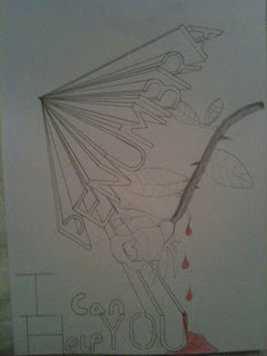
Here is a post that links to Blaine's blog concerning the construction of our film poster. Our initial idea for the poster did not turn out how we wanted it to look but Blaine has provided a picture of it and explained why we came to a joint decision to put our creative brains together once again and create some new ideas. I did some drawings of some new potential posters which I have shown within another post titled out with the old and in with the new.

Blaine explains the process which he took in the creation of our poster on Adobe Photoshop and the inspiration it originated from.
To view the post follow the link below:
http://blainekenneallya2media.blogspot.com/2011/02/poster-production.html

Monday, February 7, 2011

Out with the old and in with the new and improved poster

Both myself and Blaine discussed the film poster and after Blaine created a mock up of our initial poster idea which overall looked extremely unprofessional and did not in anyway shape or form get the audiences attention for the right reasons, apart from, that looks so rubbish I will point and laugh.
Blaine was unhappy with the outcome and decided to share his thoughts with me over the phone because I hadn't seen it yet. I trusted his judgement and he told me a new idea he had so after a long discussion (good thing I'm on contract) I said I would draw up some mocks of the new poster idea and below are two ideas that I envisioned from Blaine's explanation.


We then meet up the next morning for our three hours of media and exchanged more ideas. Blaine then set about the construction of our final poster with me on the sideline offering assistance and feedback, both positive and negative which we then discussed and compromised on certain features. Overall the poster looks great and I am happy that our first idea didn't work because I think that our new and improved version is much more interesting. Not only this but after reading the analysis of our qualitative questionnaire which wasn't available on the construction of our first poster, the three main features that our target audience wanted the poster to include were an eye-catching image, image of the main character and a catchy tag-line. Out of the three I think we have included a catchy image in the sense of the title, the layout of the multiple Penumbra titles with the images behind them are very eye-catching in my opinion but I will create a small feedback session for people to comment on the poster to finalize my oppinion. we also included a picture of the main character but not only this we included the forth most favorite answer within our questionnaire, which was a sense of mystery. This is also included because you cannot she the face of the main protagonist, even more than that, you do not know who or what his relationship is to the film is. His face can be seen within one of the Penumbra titles, but this still adds a sense of mystery because myself and Blaine know this but a random consumer of the poster will not. We didn't include a catchy tag-line because however much we tried to think of one which was ambiguous but not cheesy we couldn't decide on a final one. An idea was 'I can help you' but we decided that we wouldn't include this or any tag line because it is very risky in the form of being judged and criticized.
The last inclusion within the poster was the names of the main actors and directors upon the poster at the bottom which Blaine researched and found a font online which was very similar to the actual movie font that is used but free of charge. He found and installed a font called 'Rothman' which looked very authentic and works well upon the poster.
To view the all most finished poster with just some minor adjustments the poster is provided below:

Friday, February 4, 2011

Call sheet

A call sheet is a list of actors who will be required on set for each day's shooting as well as the preparation that needs to take place in order to make sure the production process runs smoothly.
We are shooting on around 6 separate days if everything goes according to plan and this is the call sheet that we have been using whilst filming and in preparation for upcoming filming dates.
The dates that I have included are not set in stone, this is due to the fact that we are not paying our friends to participate within our film, they are giving up their time out of the kindness of their hearts so in return we are mainly working around what days best suit them and which days they are available together when needed.
A call sheet can be simple or it can be very, very detailed. Our call sheet does not need to be overcomplicated like for example a feature length film call sheet with hundreds of actors needed each day, vast amounts of camera equipment, lighting equipment, wiring, sets, explosives..... You get the point. Our call sheet is laid out in a very simple two column design that includes all the information needed. To view our call sheet, which may have amendments if filming dates change follow the link below:

Wednesday, February 2, 2011

Quantitative feedback analysis Blaine's blog

Both Blaine and I constructed a questionnaire to acquire information about potential consumers demographics which will help us to understand where we could advertise our short film, but as well as just finding out about their demographics we asked very guided questions about our subsidiary products, which would then help us within the construction process of both our poster and review. After analyzing the questionnaire results, the graphs show specific elements that consumers want to be included within these subsidiary products.
Blaine has provided some evidence of the results and analyzed what we have concluded from them.
To view Blaine's post follow the link below:
http://blainekenneallya2media.blogspot.com/2011/02/quantitative-audience-research-analysis.html

Thursday, January 20, 2011

Production log 4

Yesterday we filmed our penultimate production log, bringing you up to date with our progress throughout the course and future tasks and ideas that we wanted to share with you.
We discussed vast amounts of research and ideas that we wanted to share and develop upon together before the production log so check out some previous posts to read what we are briefly discussing here.

Friday, January 14, 2011

Initial poster and review layout plans

Blaine has produced some drafts of some potential posters that we could use and he has also created a layout of a two page spread within a film magazine which we could place our review on. Because mainstream magazines do not really have reviews of short films unless they are very critically acclaimed. To read Blaine's post with detailed explanation of our choices follow the link below to his blog.