Blaine is somewhat a Shakespeare of today's society, with his very elaborate and extensive range of vocabulary backed up by his some what baffling knowledge we both agreed that he would write the internal monologue script. we both discussed what we wanted the monologue to give to the audience and Blaine then went away and wrote some potential lines for each scene.
Like Blaine said within his post we didn't know how it would sound until we were there watching the film and listening to the monologue but because we had planned everything to a fine detail, the final product sounded great. To view Blaine's somewhat detailed post that shows his vast capability and wisdom with words follow the link below: Internal monologue Blog post
When writing the reviews for our magazine article we had to both keep the the stereotypical style of writing that is used within empire magazine which is discussed on my post film review analysis along with the demographics of the target audience that 'Empire' magazine is aimed at.
We also had to write the reviews with the audience feedback in mind which we acquired through our questionnaire. We analyzed the information and the results can be seen upon Blaine's post Quantitative feedback.
To view the review that I wrote in the style that empire magazine uses follow the link below:
Credits have to be perfect in order to leave the audience thinking that they have just watched a profesinal film. If directors, actors, extras and many other people are not credited within films correctly or forgoten to refence everyone and their envolvement this would give very unprofeshinal feel to the film and would be an insult to anyone that was kind enough to help us in the creation of it.
I decided to create a mock up of some credits that we could potenially use. I say potentially use but the thought never crossed my mind that we would use them because I was trying to create them to look fancy and play around with the effects on sony vegas which is the editing software I have at home.
Half way through I decided I would use them as a DO NOT video in the creation of credits.
I made them look good so they could be used in the creation of other certian products with different requirments. But i also include some mistakes and left out some actors names.
Although I did leave out some names, consumers of the product would be unaware of this (unless it was a very well known main actor) but it is not the consumer that it would seem unprofeshinal to but the actors or technitions ...etc that were forgoten and worked hard aswell as giving their time to create the film.
Below is the video of the credits that we will not be using, because they do not fit the conventions of a steryotypical short film or feature length films credits as well as the mistakes they have within them and absence of actors.
After creating this video I created a list of everyone that featured within the film that we need to credit as well as a special thanks to Joel for letting us use his soundtrack. These will be the people that are credited within our film:
Starring: Toby Barrett George Frost Eloise Fitt
Supported by: Martin Palmer Anne Palmer Lewis Surridge Jonny Brown Victoria Moore Jamie Reeves Alex Smith Conor Murry Libby O'leary Daniel knights Martin Cambell Jordan Bezants Lydia Earl Ben Goulder Jessica Mills
After Blaine analyzed the results to the questionnaire that we created. I have a great understanding of the content that is needed within our review as well as the layout that people mostly desire. Blaine originally created a potential layout for our magazine but since then we have been discussing the layout and I have researched a lot into the language used within the Empire magazine which can be found within my post Film review analysis as well as the typical layout that is used including unique elements and their demographics.
With images from the actual film, the film release date and a clearly defined rating of the film all ranking in the top answers of our questionnaire, these elements will defiantly be included. Results also showed, two other popular selections were comparisons to other films and an unbiased perspective, which myself and Blaine may include.
These elements both within the content of our review and concerning the layout have been created below in the ongoing construction of our review:
This is my initial drawing of the layout used within Empire magazine with the elements that they use upon most of their review pages. For example the black lines to give the sense of a boarder upon the top and the bottom, this is also achieved with the dots that they use to break up each review and use them as a border around each review and images. Empire also use yellow lines/boxes at the start of each small review with the vital film information next to it that the reader desires.
It is easy to re-create the black boxes as they are black, but all the other elements that are included within the page have to be researched. I have done lots of research into the Fonts that they use, the text size, the colouring of the dark green titles and the colouring of the dark yellow boxes. I searched multiple websites, read multiple back pages of different empire magazines but there is no reference to the colours and fonts that they use. This was initial very annoying but I played around upon Microsoft Publisher and tried to re-create the colours that are used and tried to find the nearest font.
Here is a picture of the stereotypical Empire magazine layout of a review review page used for smaller multiple reviews which I based my drawing on above:
After researching and then trying to mimic the nearest possible colours and fonts I began to construct our review page which would be a new feature promoting short films and a competition to enter.
Above is a picture showing the creation of our film review page and I was trying to re-create the elements that are used. I created the black line/box which is used as a visual border on the page and defines the layout.
Empire is sponsored by Jameson and they are their main sponsor which usually cover new features that are introduced to the magazine. Because myself and Blaine are creating this review page based on a new feature introduction I thought it would be very professional to include their sponsors logo and gives the review a sense of continuity alongside the other visual elements that are included.
After finding the Sponsors logo and recreating the visual boarder, I started to design the page layout from an existing page but changing the elements and the content. I am trying to re-create the colour scheme that is used with a very dark green/blue as the titles and sub-titles with the lines acting as boarders and the dark yellow with the review information boxes.
Above is a picture of the ongoing construction of the review page and both myself and Blaine are currently writing reviews in order for me to then try and fit everything on the page in a neat and orderly fashion and overall making our review look exactly like it is a new feature within the Empire magazine because this is where our review is featured. It is very hard to find out the actual font and text size that empire use as well as the colour schemes but i am trying to re-create them as much as possible.
When to final review is finished and the layout is perfect I will post a link below which you can follow to view our final product of the subsidiary task, creating a review:
Throughout our short film the protagonist selflessly takes pain away from others but is then acquires it himself. This is done through the process of him touching someone in pain both emotionally and physically. Myself and Blaine wanted to create a short sequence that could progressively play each time he touched someone in need and took the pain away. We wanted the sequence to be very symbolic and we both were inspired by many of David Lynch films with his weird and wacky symbolic signifiers that are both visual interesting but important to the narrative. We wanted to re-create a very visually stunning piece but very realistic and intriguing creating the effect upon the audience that we desired also adding to the narrative and the symbolism it possesses.
After we filmed the footage i was really excited to get home and play around with the software effects trying to make a sequence that could be useable or at least act as a point which we could both add to in the future editing process.
I wanted to add a sound effect of the protagonist entering and exiting this trance state which is shown within his thoughts through the use of this footage. I tried to recored this on my iphone which was fit for purpose at the time because there was no other sound recording equipment available but now our school has purchased a boom so it will be easier, clearer and better quality once we have recorded the sound on that.
Below is a video of my voice just trying to re-create this existing of a dream like state.
When i was editing the footage i was playing around with the effects that were available, changing the huge and saturation, changing the colour scheme whilst adding key frames to the footage and overall i think for a first attempt the footage looked awesome and the sound added works well. But for our final product a lot more tweaking will take place with better sound and a lot smoother transition between live footage and this footage adding to the whole effect it has on the audience and will make them ask questions into what the footage is symbolizing.
To view the clip of the short dream sequence/flashback watch the video below:
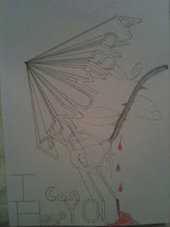
Both myself and Blaine discussed the film poster and after Blaine created a mock up of our initial poster idea which overall looked extremely unprofessional and did not in anyway shape or form get the audiences attention for the right reasons, apart from, that looks so rubbish I will point and laugh. Blaine was unhappy with the outcome and decided to share his thoughts with me over the phone because I hadn't seen it yet. I trusted his judgement and he told me a new idea he had so after a long discussion (good thing I'm on contract) I said I would draw up some mocks of the new poster idea and below are two ideas that I envisioned from Blaine's explanation.
We then meet up the next morning for our three hours of media and exchanged more ideas. Blaine then set about the construction of our final poster with me on the sideline offering assistance and feedback, both positive and negative which we then discussed and compromised on certain features. Overall the poster looks great and I am happy that our first idea didn't work because I think that our new and improved version is much more interesting. Not only this but after reading the analysis of our qualitative questionnaire which wasn't available on the construction of our first poster, the three main features that our target audience wanted the poster to include were an eye-catching image, image of the main character and a catchy tag-line. Out of the three I think we have included a catchy image in the sense of the title, the layout of the multiple Penumbra titles with the images behind them are very eye-catching in my opinion but I will create a small feedback session for people to comment on the poster to finalize my oppinion. we also included a picture of the main character but not only this we included the forth most favorite answer within our questionnaire, which was a sense of mystery. This is also included because you cannot she the face of the main protagonist, even more than that, you do not know who or what his relationship is to the film is. His face can be seen within one of the Penumbra titles, but this still adds a sense of mystery because myself and Blaine know this but a random consumer of the poster will not. We didn't include a catchy tag-line because however much we tried to think of one which was ambiguous but not cheesy we couldn't decide on a final one. An idea was 'I can help you' but we decided that we wouldn't include this or any tag line because it is very risky in the form of being judged and criticized.
The last inclusion within the poster was the names of the main actors and directors upon the poster at the bottom which Blaine researched and found a font online which was very similar to the actual movie font that is used but free of charge. He found and installed a font called 'Rothman' which looked very authentic and works well upon the poster.
To view the all most finished poster with just some minor adjustments the poster is provided below:
Penumbra? Do you know what this means? If yes.... good, if no... even better. This is the name of our short film and it is a very ambiguous name because not that many people know what it means. This fits well with our target audience as under the Two step flow theory of the effects models, audiences will want to find out more about the name and consequently what the film is about, this will lead to discussions with friends and can lead to research upon the internet.
For more information on our title name Penumbra follow the link below to my co-directors blog where he explains what it means and how this fits within our genre.
Blaine has also produced a short video that represents a way our title can be shown on screen before our film. In my opinion the simplicity adds to the impact it has upon the audience and as it starts to get bigger and turn you as the audience just become intrigued by the unusual rotation that is taking place. Overall i think it is very simple but very effective but to cast your own opinion watch the video below.
Yesterday we filmed our penultimate production log, bringing you up to date with our progress throughout the course and future tasks and ideas that we wanted to share with you.
We discussed vast amounts of research and ideas that we wanted to share and develop upon together before the production log so check out some previous posts to read what we are briefly discussing here.
Blaine has produced some drafts of some potential posters that we could use and he has also created a layout of a two page spread within a film magazine which we could place our review on. Because mainstream magazines do not really have reviews of short films unless they are very critically acclaimed. To read Blaine's post with detailed explanation of our choices follow the link below to his blog.
We set about making this production log a little different to our usual production log entries because we had just had a tutorial on how to use Final cut express, we ended up using the end of the actual production log because we wanted to manipulate it within Final cut express to practice and show our learning experience. Feel free to watch the video below and laugh at us, not with us, at us, due to our very individual sense of humor.
We do only have access to Final cut express and we were informed that their will be certain limitations between using the express version and this can be seen within the video. We created a mask over myself to turn me black and white but within the express version we could only create a box/square mask around me and then bevel the edges which looked good but not to the professional standard that we desire our film to be, so in order to achieve this standard we may use a different editing program to achieve this one effect known as the 'Sin city' effect.
Within our film we want to add some post production effects to the visual style of parts of our film to help convey the narrative structure and other parts to make the visual style have a greater impact upon the audience. When editing our film we will be using, final cut express and this is new editing software to both myself and Blaine. We both have experience in using and utilizing the editing software of Imovie as well as this we both have some experience in editing within Sony Vegas knowing the basic editing skills and how to apply some effects and titles. In order to make our short film professional we wanted to learn how to use Final cut, this is not saying that it wouldn't look professional if this editing software was not used but this is the software that is widely used within the movie production industry and to learn a new skill that could be applied in any future job is a great step in moving from school work towards potential products that may be consumed and bought by the general public. we set about arranging a short session with the new technician at school because has experience in using the software and could talk us both through the basics that we need to know and he may possibly know how to apply some specific after effects that we would like to include as well as some composition changes.
When we met up with the technician there where some specific elements that we wanted to learn. We wanted to work out how to change the huge and saturation, as the composition change will create an explicit distinction to the change of chronological order as the flashback and his quick childhood/symbolic memory will be in Black and white. This is a very easy effect to create as there is a pre-set colour manipulation tool which can be used to automatically change the shots to black and white but if we wanted to sharpen up the contrast or add a tinted colour then this can easily be done within the colour manipulation settings.
We also wanted to know if we needed to create a mask over a certain object to change the colour of this object and this object only. We want to use this after effect to put emphasis on a red rose when a finger is pricked in the main protagonists quick symbolic memory that occurs each time he absorbs the pain of others. After filming some quick test footage that we could try and manipulate we played around with the editing tools and found that you can put emphasis upon a certain object by just changing the contrasts of the colour's, the huge and saturation and the colour corrector tool that is within the software this can give of a good effect that we may want to use.
Another way could achieve what is known as the 'Sin city effect' when the certain colour's are emphasised and brought into the viewers focus. Within the extras of the Sin city DVD some of the editing techniques are included and the way that they achieve this effect was by using a green screen which we could try and do. To view a short segment of sin city to see the well renowned Sin city effect in action watch the video below:
The final effect that we want to include is the layering of clips. We want to use this effect to represent a young girls channel of thinking as she stares out of a window, deep in focus. We want to have a the shot of the girl as the main clip but then we want to layer multiple clips over the top of her parents arguing to represent the troubles she may have at home and how this is effecting her. This can be done in two ways: The first way can achieve this effect by using simple transitions of the multiple clips. If you change the opacity of the clips, feather the edges and possible add some motion blur the quick transitions will create the effect of the girls thoughts and this will be emphasized by the dominant static shot of the girl after we have slowly zoomed in on her head as a signifier to the audience that what follows are her thoughts. For an example of the overlaying effect watch the video bellow:
The second way is to change the opacity of the overlaid shots and to have them featured within the space situated within the shot of the girl. If feathering is added then this could stop the overall shot looking very regimental but depending on the content of the argument it may be too small and overall have this regimental look which would be very unprofessional as well as boring for the audience.
After learning all these skills we now feel very confident that we can make our short film to a very high standard.
Myself and Blaine did a small 30 second short clip of one of the shots that we want to include within our film. It is just a quick test of the location and sourroundings to see what the noise levels were and natural lighting that was avalible. It was extremal cold so my hands were shaking like mad but we can over come these factors by having professional equipment when the real production is filmed for example a tri-pod, some gloves and a better camera will all be vital equipment we will use when the clapper board snaps for scene one take one of our short film as well as estensive planning on behalf of myself and Blaine and professional acting. (Sorry blaine)
Most writers, film directors and script developers have a preference for one style of writing over another. Some writers are more interested in developing complex, interesting, and quirky characters. Others indulge in eye catching visual effects or heart pumping action. Myself and Blaine are very interested in very complex narrative based films which are predominantly character driven and this is to a certain extent what our short film will consist of. We have taken inspiration from many films that follow this style. Blaine's posts on sources of inspiration and Directorial techniques to consider as well my posts, Inspiration for our short film, True leaders of film and Three inspirational films from our teacher extensive DVD collection show our interest in this style and how we were inspired by these films and their unique styles.
Our film will strongly focus on the emotional development of the main protagonist and due to this being our main focus we want the cinematography to be very minimalistic, giving off a great sense of realism but also to accentuate that the main protagonist is just a real man in the real world, any over elaborate visual effects will digress from this sense of realism as well as the over attention to detail as it would then not portray the real world but an idealised version. This links with the postmodern theorists that we are learning about throughout the A2 course and how they believe the media portray an idealised world to us and this is another post-modern asset that our film includes, we want to portray the real world. Both Blaine and myself have discussed the visual style of our film in great detail and my fellow director has written a post on cinematography: the look of our film which gives an overview of our discussions as well as some great examples for you to look at. Above is just a very simple picture of a location which could be used within our first scene, it would be the place were the main protagonist wakes up, the protagonist would be centralised within the shot on the path laying down. These four shots give you an example of the overall location that we want to use. The graveyard will be the opening location and because it is a very morbid but surreal place it will add to the ambiguity of why the main protagonist is their. The shots above are some examples of some establishing shots we could use before you see the protagonist on the floor, these establishing shots will set the mood of the film as well as providing a picture the audience can paint of the general surroundings that the main protagonist is in. Like myself and Blaine said the shots we used will still be thought about and look great making sure we portray the message that we want they will just not be overly visually stunning due to the realism we want to create.
Another idea that we had was to have a two shot of a couple of graves, one of them being rendered down a little and he other either relatively new with some flowers next to it. This shot will juxtapose the two types of graves showing that one is frequently visited with fresh flowers placed upon it and generally being clean, but this will then be emphasised by the rendered grave or grave with no flowers signifying the difference between them. we want to then use a close up shot of the rendered grave making sure that the name is in focus and centralised within the shot, this will mean nothing at the time but it will be referenced later within the film. We also played around with the shadows around the graveyard which made the visual look of the shot very aesthetically pleasing, this part of the location could be used for the protagonist to walk through, he would also create a shadow and with the glare from the sun there would be minimal detail on him so he would look basically like a shadow. we wanted to uses this part of the grave yard because it has no path and this would be a great place to bring in the theory of semiotics that Blaine was deconstructing for one of our ancillary products. We want the protagonist to walk on the grass but respectfully not walk at the heads of the grave stones where many people would create a visual outline of where the body is. This would show and act as a sign of respect and would correspond to the protagonists selflessness nature. This would be a very simple way to incorporate semiotics within our short film but it would show that we are thinking about the production of our film in great detail. This is a picture of the road just outside the graveyard. We managed to create a very good image on camera incorporating the light of the sun that beams down onto the road where the protagonist will walk. The darkness at the side will emphasise the beam of light that the protagonist appears to be walking towards. the outline of the protagonist will only be visible as he walks down the road to end the first scene. When taking this picture I thought about our underlying style that we wanted to include, film noir, which will also be portrayed within the flashbacks of the protagonist. This then meant that we had to think about the chiaroscuro within some shots to conform with the conventions of film noir. Within this picture I was trying to re-create the glare from the sun that blinds you if you look towards it, so I faced the camera towards the sun just over the trees to reconstructed the visual image of the protagonist opening his eyes to be blinded by the sun. This did work to a certain extent but the image is not bright enough to re-create the effect on screen but I think we will have to create some artificial light to help create this effect on camera or we could add an effect on within the post production process.
Whilst we were walking around we came across an archway of trees which created a very mysterious walkway which we could try and use within our film. I thought about this later on in the day and I realised that if we did use this archway then it wouldn't be conforming to the minimalism that we want the cinematography to portray.
Over all after taking these location shots it has boosted my confidence within our chosen choice of location, first of all because we acquired permission to film within the graveyard. But whilst looking around and taking pictures I began to create the movie within my head, planning out every shot and detail that we would include and it all started to piece together.
Our choice to use the graveyard for our first scene I think will create the first enigma within the audiences mind. 'well why is this man here, on the floor?' I think it will give the correct ambience that we are looking for, which is to have a familiar location that the audience can relate to because this will add to the realism but they will have no idea why the man has woken up their and due to the overall mysterious and spooky feel that a graveyard includes it will add to the ambiguity of the whole film and can create many questions that the audience are left with still un-answered which corresponds to the postmodern active consumer that our film is aimed at.
These images are just locations shots and do not convery any of the camera shots and angles that we want to use within our film. This will be done within our pre-production testing with the main protaganist within the film and this will be filmed , uploded and analysed shortly afterwards.
Our second production log can be seen on my Co-director, Blaine Kenneally's blog as he kindly uploaded the second instalment to our ongoing production log/research/analogy/evaluation videos. In my opinion this is a very good way for us to track our progression throughout the course and it is working great so far. Our teachers also like the frequent updates to.
Bellow is a link to the critical/analytical/amusing second video:
Today we filmed our first production log of many to come as this is a great way to monitor progress and tell you what we plan to do in the future, report if this was completed and then set new goals for the following weeks. Bellow is the link to Blaine Kenneally's blog as he kindly uploaded and edited the video:
Hans Zimmer is amongst the most respected composers within the film industry and as a composer in general, the German composer and music producer is most notable for integrating electronic music sounds with traditional orchestral arrangements.
He, himself has won four Grammy Awards, two Golden Globes, a Classical BRIT Award, and an Academy Award. He was also ranked 72nd in the top 100 living geniuses which was a poll collaborated by The Daily Telegraph. Not only does Zimmer compose for films but he composed the opening titles to the world record holding video game, Call of duty: Modern warfare 2. sales reached $301 million dollars in the first 24 hours of release in the UK and U.S alone.
Myself and Blaine are adamant about using a soundtrack that was previously released on a computer game. The main narrative ideas have originated from a computer game and we want our main soundtrack to also be from a computer game. Our reasons for this is that 'we think it will give our short film a very post modern vibe, when people find out that the narrative and soundtrack originated from video games, this will enhance the sudden world wide interest that can be clearly seen above with Call of duty modern warfare taking over $310 million dollars within its first 24 hours of release.' The new instalment to the call of duty franchise: Call of duty Black ops which is set to release on November 9th 2010 is set to break records and this statement was released by one of the worlds biggest video game website. Gamespot UK regarding the progress. “We are ahead of where we were with Call of Duty: Modern Warfare 2 last year, which previously set the industry standard.”
This one video game franchise is part of a much bigger industry and with such interest in just this one game, overall the video game industry must be booming.
Quentin Tarantino is quintessentially known for the soundtracks included within his films, many of his soundtracks pay homage to other films or novels that he has been inspired from. All the soundtracks that are used within his films are available to purchase on Itunes and many websites such as Amazon. The soundtracks he uses are more of a collaboration than original soundtracks which creates his own original style but this style is now associated with Quentin Tarantino and sets him apart from other directors, his quintessential blood and gore with very humorous, but controversial violence in my opinion is provides a great example for Auter theory, which is based around the concept that if a filmmaker has such a unique style which can be instantly recognisable then their artistic voice will transcend genre.
'I don't believe in putting in music as a band aid to get you over some rough parts or bad film making. If it's there it's got to add to it or take it to another level'
This statement from Tarantino himself sums up what soundtracks are all about. This is why we want to include soundtracks within our short film and the main soundtrack that we have chosen will defiantly add to the whole film taking it to another level.
Our Main soundtrack is from a video game called Black Mesa Source: Half life. the soundtrack is titled End credits and we want to use it to end our film, we think that the track will heighten the atmosphere as well as setting the mood that we want the audience to be feeling that will make them thoroughly evaluate the content they have just seen. Because the soundtrack does not belong to me I sent an email to the original composer, joelnielsen asking permission to incorporate his soundtracks within our film. Generously Joel emailed me back granting permission for me to use his soundtracks within our films. This was very exciting news and I would just like to thank Joel for letting us use his exhilarating soundtracks. If you want to visit his website follow the link : http: http://www.joelnielsen.com/ and if you want to preview the soundtrack we are going to use, then watch or rather listen to the video below:
I have provided evidence below of the email I sent to Joel and the reply from him granting me permission:
This is our first presentation giving you an insight into some of the ideas we want to incorporate into our short film. We did research on what a short film conventinally consists of, a bit of history about them, some typical genres and narratives as well as pitching to our class (the bottom end of our potential age bracket for consumers)what our interesting narrative would be aswell as some music that could be used. We want to make a very psycological short film which explores the actions of others and how the very helpfull and selflisness citerzen can often go unoticed. To view our 20 minute pitch (ironic that the pitch is longer than the final product) watch the video bellow kindly uploaded by my co-director. Blaine Kenneally

 To view Blaine's somewhat detailed post that shows his vast capability and wisdom with words follow the link below:


 Above is just a very simple picture of a location which could be used within our first scene, it would be the place were the main protagonist wakes up, the protagonist would be centralised within the shot on the path laying down.

 We also played around with the shadows around the graveyard which made the visual look of the shot very aesthetically pleasing, this part of the location could be used for the protagonist to walk through, he would also create a shadow and with the glare from the sun there would be minimal detail on him so he would look basically like a shadow. we wanted to uses this part of the grave yard because it has no path and this would be a great place to bring in the
  This is a picture of the road just outside the graveyard. We managed to create a very good image on camera incorporating the light of the sun that beams down onto the road where the protagonist will walk. The darkness at the side will emphasise the beam of light that the protagonist appears to be walking towards. the outline of the protagonist will only be visible as he walks down the road to end the first scene. When taking this picture I thought about our underlying style that we wanted to include, film noir, which will also be portrayed within the flashbacks of the protagonist. This then meant that we had to think about the chiaroscuro within some shots to conform with the conventions of film noir.


