Showing posts with label Evidence 27. Show all posts

Friday, March 18, 2011

The finished review

After the review was finished I brought it into school and myself and Blaine went through it thoroughly and corrected any spelling mistakes, changed a couple of the sentence structures and added and took away parts of the review layout and border where necessary.
To view the construction of the review follow the link below:
After we made these tweaks, we printed the final review out and decided to get some market testing and asked some questions surrounding the review and poster to potential consumers within the categorization of our target audience.
This is the review that we previewed to them and you can see their comments on my other post... Qualitative feedback poster and review
After both Blaine and I had a discussion involving their comments we made any necessary changes and here is the final review page below:

Monday, March 14, 2011

Writing the reviews

When writing the reviews for our magazine article we had to both keep the the stereotypical style of writing that is used within empire magazine which is discussed on my post film review analysis along with the demographics of the target audience that 'Empire' magazine is aimed at.
We also had to write the reviews with the audience feedback in mind which we acquired through our questionnaire. We analyzed the information and the results can be seen upon Blaine's post Quantitative feedback.
To view the review that I wrote in the style that empire magazine uses follow the link below:

Blaine has done a post exhibiting the reviews that he wrote and the construction process along the way.
To view the two reviews that Blaine created and the process of writing them follow the link below:

Friday, March 11, 2011

Credits

Credits have to be perfect in order to leave the audience thinking that they have just watched a profesinal film. If directors, actors, extras and many other people are not credited within films correctly or forgoten to refence everyone and their envolvement this would give very unprofeshinal feel to the film and would be an insult to anyone that was kind enough to help us in the creation of it.

I decided to create a mock up of some credits that we could potenially use. I say potentially use but the thought never crossed my mind that we would use them because I was trying to create them to look fancy and play around with the effects on sony vegas which is the editing software I have at home.

Half way through I decided I would use them as a DO NOT video in the creation of credits.

I made them look good so they could be used in the creation of other certian products with different requirments. But i also include some mistakes and left out some actors names.

Although I did leave out some names, consumers of the product would be unaware of this (unless it was a very well known main actor) but it is not the consumer that it would seem unprofeshinal to but the actors or technitions ...etc that were forgoten and worked hard aswell as giving their time to create the film.

Below is the video of the credits that we will not be using, because they do not fit the conventions of a steryotypical short film or feature length films credits as well as the mistakes they have within them and absence of actors.


Penumbra credits from Tom palmer on Vimeo.


After creating this video I created a list of everyone that featured within the film that we need to credit as well as a special thanks to Joel for letting us use his soundtrack. These will be the people that are credited within our film:

Starring:
Toby Barrett
George Frost
Eloise Fitt


Supported by:
Martin Palmer
Anne Palmer
Lewis Surridge
Jonny Brown
Victoria Moore
Jamie Reeves
Alex Smith
Conor Murry
Libby O'leary
Daniel knights
Martin Cambell
Jordan Bezants
Lydia Earl
Ben Goulder
Jessica Mills

With special thanks to:
Joel Neilsen
James Wigger

Sunday, February 20, 2011

On set organization Blaine's blog

Throughout the production process on set organization has been key in making sure that every thing runs smoothly to a certain extent that is manageable. Because we cannot control the weather some dates which we planned to shoot or even tried, have had to be prospered or re-shot due to the weather, but umbrellas where always on had because myself and Blaine had a contingency plan for if such circumstances occurred.
Blaine has made sure that all technical equipment was working and charged before each day of shooting as well as the shot lists that we defiantly wanted to get but could then be added to on the day if we thought a specific shot would look good and our creativity took over.
To view Blaine's post on our on set organization follow the link below:

Thursday, February 17, 2011

Penumbra, Short review construction

After Blaine analyzed the results to the questionnaire that we created. I have a great understanding of the content that is needed within our review as well as the layout that people mostly desire. Blaine originally created a potential layout for our magazine but since then we have been discussing the layout and I have researched a lot into the language used within the Empire magazine which can be found within my post Film review analysis as well as the typical layout that is used including unique elements and their demographics.
With images from the actual film, the film release date and a clearly defined rating of the film all ranking in the top answers of our questionnaire, these elements will defiantly be included. Results also showed, two other popular selections were comparisons to other films and an unbiased perspective, which myself and Blaine may include.
These elements both within the content of our review and concerning the layout have been created below in the ongoing construction of our review:
This is my initial drawing of the layout used within Empire magazine with the elements that they use upon most of their review pages. For example the black lines to give the sense of a boarder upon the top and the bottom, this is also achieved with the dots that they use to break up each review and use them as a border around each review and images. Empire also use yellow lines/boxes at the start of each small review with the vital film information next to it that the reader desires.
It is easy to re-create the black boxes as they are black, but all the other elements that are included within the page have to be researched. I have done lots of research into the Fonts that they use, the text size, the colouring of the dark green titles and the colouring of the dark yellow boxes. I searched multiple websites, read multiple back pages of different empire magazines but there is no reference to the colours and fonts that they use. This was initial very annoying but I played around upon Microsoft Publisher and tried to re-create the colours that are used and tried to find the nearest font.
Here is a picture of the stereotypical Empire magazine layout of a review review page used for smaller multiple reviews which I based my drawing on above:

After researching and then trying to mimic the nearest possible colours and fonts I began to construct our review page which would be a new feature promoting short films and a competition to enter.

Above is a picture showing the creation of our film review page and I was trying to re-create the elements that are used. I created the black line/box which is used as a visual border on the page and defines the layout.
Empire is sponsored by Jameson and they are their main sponsor which usually cover new features that are introduced to the magazine. Because myself and Blaine are creating this review page based on a new feature introduction I thought it would be very professional to include their sponsors logo and gives the review a sense of continuity alongside the other visual elements that are included.


After finding the Sponsors logo and recreating the visual boarder, I started to design the page layout from an existing page but changing the elements and the content. I am trying to re-create the colour scheme that is used with a very dark green/blue as the titles and sub-titles with the lines acting as boarders and the dark yellow with the review information boxes.


Above is a picture of the ongoing construction of the review page and both myself and Blaine are currently writing reviews in order for me to then try and fit everything on the page in a neat and orderly fashion and overall making our review look exactly like it is a new feature within the Empire magazine because this is where our review is featured. It is very hard to find out the actual font and text size that empire use as well as the colour schemes but i am trying to re-create them as much as possible.

When to final review is finished and the layout is perfect I will post a link below which you can follow to view our final product of the subsidiary task, creating a review:

Monday, February 14, 2011

Short flashback/dream sequence edit

Throughout our short film the protagonist selflessly takes pain away from others but is then acquires it himself. This is done through the process of him touching someone in pain both emotionally and physically. Myself and Blaine wanted to create a short sequence that could progressively play each time he touched someone in need and took the pain away. We wanted the sequence to be very symbolic and we both were inspired by many of David Lynch films with his weird and wacky symbolic signifiers that are both visual interesting but important to the narrative. We wanted to re-create a very visually stunning piece but very realistic and intriguing creating the effect upon the audience that we desired also adding to the narrative and the symbolism it possesses.
After we filmed the footage i was really excited to get home and play around with the software effects trying to make a sequence that could be useable or at least act as a point which we could both add to in the future editing process.
I wanted to add a sound effect of the protagonist entering and exiting this trance state which is shown within his thoughts through the use of this footage. I tried to recored this on my iphone which was fit for purpose at the time because there was no other sound recording equipment available but now our school has purchased a boom so it will be easier, clearer and better quality once we have recorded the sound on that.
Below is a video of my voice just trying to re-create this existing of a dream like state.

Creating sound effects from Tom palmer on Vimeo.

When i was editing the footage i was playing around with the effects that were available, changing the huge and saturation, changing the colour scheme whilst adding key frames to the footage and overall i think for a first attempt the footage looked awesome and the sound added works well. But for our final product a lot more tweaking will take place with better sound and a lot smoother transition between live footage and this footage adding to the whole effect it has on the audience and will make them ask questions into what the footage is symbolizing.

To view the clip of the short dream sequence/flashback watch the video below:

Short flashback/dream sequence from Tom palmer on Vimeo.

Friday, February 11, 2011

Narrative theory

Walter Fisher introduced the concept on Narrative theory in 1960 and it explored how humans communicate and then receive.
He believed that everything could be divided into two universal paradigms, which are particular arrangments of related elements. The first categorization was:
Rational World Paradigm:
  • People are rational
  • People make decisions based on arguments
  • Rationality is determined by how much we know and how well we argue
  • The world is a set of puzzles that we can solve through rational analysis
The second paradigm was:
Narrative Paradigm
  • People are essentially storytellers
  • Stories are found on history, biography, culture and character
  • Narrative rationality is determined by the coherence and fidelity of our stories
This model of human communication within which human beings as individuals take complex information and establish it into a form of narrative categorizes humans as what Fisher believes to be "Storytelling animals" exchanging messages with each other which are then judged and exchanged by others depending on their values and beliefs.
This is a very complex way to look at narrative theory and Fishers theory goes into extreme depth which I believed to be less important for a short film because very complex narrative structure cannot be established within the five minutes that our film lasts. I also thought that a more classical narrative system did not apply to our film due to the fact that our structure is not in chronological order which means it doesn't fit in with the conventions of a, equilibrium, disequilibrium and a resolution/equilibrium narrative structure which was introduced by Tzvetan Torodov which suggests that the story starts with a status quo and then there is an event that disrupts order, and then moral order is restored.

Certain Narrative theorists have argued that all stories fit into at least one of the following story types. Most movies use a combination of these plots:

Achilles: The fatal flaw that leads to the destruction of the previously flawless individual heroine. This plot line is also the basis of most whodunit flicks with the fatal flaw belonging to a criminal, not the cop.

Candide: The indomitable hero who cannot be put down, this narrative structure is often found in franchise flicks.

Cinderella: The dream-come-true scenario where virtue is rewarded in the end. some examples of these could be shrek, my big fat greek wedding.

Faust: The selling-your-soul-to-the-devil motif where fate eventually catches up with you.

Orpheus: The gift that is taken away - this could take the form of the tragedy of the loss, or journey that follows the loss.

Romeo and Juliet: Self-explanatory. Boy meets girl. Boy loses girl. Boy finds girl again, or doesn't.

Circe: The spider and the fly, the innocent and the victim.

Tristan: Triangles - Man loves women but third party intervenes.

In my opinion our film fits into three of these story types: Faust, he takes on other people pain but this eventually become his own downfall. Orpheus, we follow his journey of selflessness which results in the tragedy of the loss of himself. Circe, he is both the innocent and the victim as his selflessness makes him the victim of others pain.
Our narrative is very post-modern with the story originating from a video game, it not being in chronological order and it leaves lots to the imagination of the consumers making the connections right or wrong. Lots of shots are used that are inspired from many different films and some of our visual effects are also inspired by certain directors such as david lynch and shane Meadows. But overall we are creating this film in the way that we want to make it using our own creative talents.
To view a very detailed presentation on many different Narrative theorists follow the link below:

Wednesday, February 9, 2011

Poster production Blaine's blog

Here is a post that links to Blaine's blog concerning the construction of our film poster. Our initial idea for the poster did not turn out how we wanted it to look but Blaine has provided a picture of it and explained why we came to a joint decision to put our creative brains together once again and create some new ideas. I did some drawings of some new potential posters which I have shown within another post titled out with the old and in with the new.

Blaine explains the process which he took in the creation of our poster on Adobe Photoshop and the inspiration it originated from.
To view the post follow the link below:
http://blainekenneallya2media.blogspot.com/2011/02/poster-production.html

Monday, February 7, 2011

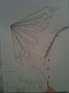
Out with the old and in with the new and improved poster

Both myself and Blaine discussed the film poster and after Blaine created a mock up of our initial poster idea which overall looked extremely unprofessional and did not in anyway shape or form get the audiences attention for the right reasons, apart from, that looks so rubbish I will point and laugh.
Blaine was unhappy with the outcome and decided to share his thoughts with me over the phone because I hadn't seen it yet. I trusted his judgement and he told me a new idea he had so after a long discussion (good thing I'm on contract) I said I would draw up some mocks of the new poster idea and below are two ideas that I envisioned from Blaine's explanation.


We then meet up the next morning for our three hours of media and exchanged more ideas. Blaine then set about the construction of our final poster with me on the sideline offering assistance and feedback, both positive and negative which we then discussed and compromised on certain features. Overall the poster looks great and I am happy that our first idea didn't work because I think that our new and improved version is much more interesting. Not only this but after reading the analysis of our qualitative questionnaire which wasn't available on the construction of our first poster, the three main features that our target audience wanted the poster to include were an eye-catching image, image of the main character and a catchy tag-line. Out of the three I think we have included a catchy image in the sense of the title, the layout of the multiple Penumbra titles with the images behind them are very eye-catching in my opinion but I will create a small feedback session for people to comment on the poster to finalize my oppinion. we also included a picture of the main character but not only this we included the forth most favorite answer within our questionnaire, which was a sense of mystery. This is also included because you cannot she the face of the main protagonist, even more than that, you do not know who or what his relationship is to the film is. His face can be seen within one of the Penumbra titles, but this still adds a sense of mystery because myself and Blaine know this but a random consumer of the poster will not. We didn't include a catchy tag-line because however much we tried to think of one which was ambiguous but not cheesy we couldn't decide on a final one. An idea was 'I can help you' but we decided that we wouldn't include this or any tag line because it is very risky in the form of being judged and criticized.
The last inclusion within the poster was the names of the main actors and directors upon the poster at the bottom which Blaine researched and found a font online which was very similar to the actual movie font that is used but free of charge. He found and installed a font called 'Rothman' which looked very authentic and works well upon the poster.
To view the all most finished poster with just some minor adjustments the poster is provided below:

Friday, February 4, 2011

Call sheet

A call sheet is a list of actors who will be required on set for each day's shooting as well as the preparation that needs to take place in order to make sure the production process runs smoothly.
We are shooting on around 6 separate days if everything goes according to plan and this is the call sheet that we have been using whilst filming and in preparation for upcoming filming dates.
The dates that I have included are not set in stone, this is due to the fact that we are not paying our friends to participate within our film, they are giving up their time out of the kindness of their hearts so in return we are mainly working around what days best suit them and which days they are available together when needed.
A call sheet can be simple or it can be very, very detailed. Our call sheet does not need to be overcomplicated like for example a feature length film call sheet with hundreds of actors needed each day, vast amounts of camera equipment, lighting equipment, wiring, sets, explosives..... You get the point. Our call sheet is laid out in a very simple two column design that includes all the information needed. To view our call sheet, which may have amendments if filming dates change follow the link below:

Wednesday, January 26, 2011

costume and props, subtial but vital parts of of our film

When people hear the word filmmaking, they immediately picture film sets with large complex cameras and do not always take into consideration the smaller things that make up these huge productions.
The importance of costumes is often overlooked, because it is a small factor that everyone takes for granted but the implications can be phenomenal if the costume is wrong in any shape or form. This is also the case for props within film.
Multinational film producers have teams of people to produce and check over any props and costumes that are made and included within the film making sure that the continuity is perfect when actors have breaks and come back to a scene with an extra button done up on their jacket. However we do not have these teams to look out for us so we will do this ourselves but just to give you an idea of the amount of effort and work that goes behind these unseen necessities of films here are some lists below of the people that would be present on set:

-Props Master

The property master, more commonly known as the props master, is in charge of finding and managing all the props that appear in the film. The props master usually has several assistants.

-Props builder

The props builder, or more frequently prop maker, as the name implies, builds the props that are used for the film. Props builders are often technicians skilled in construction, plastics casting, machining, and electronics.

-Armourer or Weapons master

The armourer is a specialized props technician who deals with firearms. In most jurisdictions this requires special training and licenses.

-Costume designer

The costume designer is responsible for all the clothing and costumes worn by all the actors that appear on screen. They are also responsible for designing, planning, and organizing the construction of the garments down to the fabric, colours, and sizes. The costume designer works closely with the director to understand and interpret "character", and counsels with the production designer to achieve an overall tone of the film. In large productions, the costume designer will usually have one or more assistant costume designers.

-Costume supervisor

The costume supervisor works closely with the designer. In addition to helping with the design of the costumes, they manage the wardrobe workspace. They supervise construction or sourcing of garments, hiring and firing of support staff, budget, paperwork, and department logistics. Also called the wardrobe supervisor. This term is used less and less.

-Key costumer

The key costumer is employed on larger productions to manage the set costumers, and to handle the Star's wardrobe needs.

-Costume standby

The Costume standby is present on set at all times. It is his/her responsibility to monitor the quality and continuity of the actors and actresses costumes before and during takes. (S)he will also assist the actors and actresses with dressing.

-Art finisher or Breakdown artist

An Art finisher may be employed during the pre-production setup to "break down" garments. This specialized job includes making new clothing appear dirty, faded and worn. They are also known as breakdown artists.

-Costume Buyer

On large productions a buyer may be employed to source and purchase fabrics and garments. A buyer might also be referred to as a shopper. This distinction is often made when the lead actor in a production has control over their wardrobe, and they may personally hire this person.

-Cutter/fitter

A costume technician who fits or tailors costumes, usually on-set. They can also be called cutters, seamstresses or tailors. Some celebrity actors have favourite cutters, and larger productions may hire several and have them on set at the same time, particularly in period film projects that might have complicated or extremely expensive extras wardrobe.


I would like to say that both myself and Blaine played the role of all of the above minus the weapons adviser, costume designer, costume buyer, and costume fitter. so overall we researched the clothes that our actors had and asked them to wear a specified costume. The main protagonist was the most important to get the look and representation of him correct. We wanted the audience to be curious why a well dressed man is laying, asleep in a graveyard clueless to how he got there. This uncertainty within the audience is what the main protagonist is experiencing and this empathy is what will engage the audience with the film and make them want to keep watching.

We told him to dress in smart casual so: Jeans, he had some converse shoes, a shirt which can be seen within the scene under a black smart coat. We also wanted him to have a bag which was a contrast to his jacket and jeans. Overall he looks very good and within the scene that we have filmed the costume has worked perfectly, every time we have filmed we have asked him to remember what he is wearing due to the fact that the narrative of our film happens all in one day which means we need him to look the same to have good continuity.

The Main props we are using are; a red rose with thorns which the young girl will touch and bleed which leads us to the other main prop, blood. I researched into how to make blood and there where many different ways to do so, I tested lots of different formulas but thought that treacle and food colouring worked the best.

Apart from these main props which we have already bought or made there are no other purchases that need to be made. In terms of costume we need to make sure that the teacher looks like a teacher and the girl is presentable and creates the correct representation of her character, we also need to keep making sure that Toby, our main protagonist keep wearing the same attire to keep continuity in check. Overall we have learnt through many discussions and research how to represent characters through costumes and Mise-en-scene to the extent that we want them to be interpreted by the audience.

Monday, January 24, 2011

Penumbra our ambiguous short film title

Penumbra? Do you know what this means? If yes.... good, if no... even better. This is the name of our short film and it is a very ambiguous name because not that many people know what it means. This fits well with our target audience as under the Two step flow theory of the effects models, audiences will want to find out more about the name and consequently what the film is about, this will lead to discussions with friends and can lead to research upon the internet.

For more information on our title name Penumbra follow the link below to my co-directors blog where he explains what it means and how this fits within our genre.


Blaine has also produced a short video that represents a way our title can be shown on screen before our film. In my opinion the simplicity adds to the impact it has upon the audience and as it starts to get bigger and turn you as the audience just become intrigued by the unusual rotation that is taking place. Overall i think it is very simple but very effective but to cast your own opinion watch the video below.

Thursday, January 20, 2011

Production log 4

Yesterday we filmed our penultimate production log, bringing you up to date with our progress throughout the course and future tasks and ideas that we wanted to share with you.
We discussed vast amounts of research and ideas that we wanted to share and develop upon together before the production log so check out some previous posts to read what we are briefly discussing here.

Friday, January 14, 2011

Initial poster and review layout plans

Blaine has produced some drafts of some potential posters that we could use and he has also created a layout of a two page spread within a film magazine which we could place our review on. Because mainstream magazines do not really have reviews of short films unless they are very critically acclaimed. To read Blaine's post with detailed explanation of our choices follow the link below to his blog.

Wednesday, January 12, 2011

Classic movie posters and designers

Because we have to create a movie poster I thought it would be good to look at some classic movie poster and their designers.
Posters have been a strong form of advertising that many companies have adopted through the history of film production and advertising. There are many different aspects of a poster that can catch the eye of the consumer or intrigue them into the search to find out more.

The construction of a poster is not a simple task, there would be many people from a creative background, technical support and creation of the poster, researchers, Drawing artists and manager making sure that everything was above board and no rules and regulations were broken. This restrictions are a lot tighter to date but greater technology has been developed, bigger budgets are available consumer culture has changed and this has overall stemmed to new ways to advertising your film and make consumers aware of your product.

These very classic posters are just a small example of the wide range of posters that people created and how they connect with their target audience.
The E.T. and Blade runner posters were both created by John Alvin a very respected poster artist and has worked on over 200 posters.
The Clockwork orange poster was created by Philip Castle and many interpretations have been formed about the meaning behind he poster and this just shows the impact a poster can have upon your audience.
The Eraserhead poster created by Ben Barenholtz and director david lynch is just an example of how simple but effective a poster can be depending on your target audience and what you as the producer want to convey.

Marketing strategies have changed dramatically through the years but film posters still stand strong. Modern Posters have an exceptionally high standard and reputation for being extremely enticing with amazing concept art and stunning visual pleasures but at the other end of the spectrum they can also be very simple and very ambiguous. Many films do not just produce one poster anymore they create and original poster for the film but as the release date slowly becomes closer they release substitute posters creating world wide interest within audiences and build the excitement up until the release date.
I have found a really good website that hosts many images of posters called http://www.impawards.com/ and for some great examples of films that create more than one poster to create excitement within the potential consumers follow the links below for Inception and Tron Legacy which have over 15 exceptional posters each.

http://www.impawards.com/2010/inception.html


Sunday, January 9, 2011

Animatic for the first two scenes

The purpose of this animatic is to give the viewer an overall sense of atmosphere and order of the first two scenes and this is created not just by the images but with the detailed analysis and explanation throughout by Blaine Kenneally up selling the film giving a general ordering of the shots, sounds and effects we intend to use.

Short Film Animatic from Blaine Kenneally on Vimeo.

This animatic can not only act as a visual aid for ourselves it can act as a supplement for the active consumer of our film. They will watch this animatic but it could act as a short teaser trailer enticing them to want to find out more and watch the finished product.

Sunday, December 26, 2010

Representation theory, analyzed by Blaine Kenneally

Representation can dramatically affect a person's interpretation of a film, the filmmaker is in control of the representation of the characters by choosing: what they wear, their personality, their hobbies, their lifestyle and the events that they participate in within the film. All these aspects contribute to the audiences interpretation of these characters and how they are judged by the viewer. The producer does not have full control over the viewers judgement because their cultural background will have an effect upon their overall judgement. This however does not effect the implied representation of certain characters that the producers portrays, for example women as inferior to men as this will not be welcomed by the viewers as it is insulting but in some circumstances is necessary within the narrative. ill either fall in love with or feel indebted to the male hero; in fact, she is somewhat repulsed by his actions.

To view my co-directors detailed post on representation with reference to a critical theorist Laura Mulveyn, who we can learn from and then apply our own knowledge and hers to our short film to make sure that characters are represented the way that we want them to be and nothing else.
Follow the link below:

Friday, December 24, 2010

Production log 3, Presenting our Final cut express effects

We set about making this production log a little different to our usual production log entries because we had just had a tutorial on how to use Final cut express, we ended up using the end of the actual production log because we wanted to manipulate it within Final cut express to practice and show our learning experience. Feel free to watch the video below and laugh at us, not with us, at us, due to our very individual sense of humor.

Production Log 3 (Experience in Editing) from Blaine Kenneally on Vimeo.


We do only have access to Final cut express and we were informed that their will be certain limitations between using the express version and this can be seen within the video. We created a mask over myself to turn me black and white but within the express version we could only create a box/square mask around me and then bevel the edges which looked good but not to the professional standard that we desire our film to be, so in order to achieve this standard we may use a different editing program to achieve this one effect known as the 'Sin city' effect.

Saturday, December 18, 2010

Editing techniques

Within our film we want to add some post production effects to the visual style of parts of our film to help convey the narrative structure and other parts to make the visual style have a greater impact upon the audience. When editing our film we will be using, final cut express and this is new editing software to both myself and Blaine. We both have experience in using and utilizing the editing software of Imovie as well as this we both have some experience in editing within Sony Vegas knowing the basic editing skills and how to apply some effects and titles.

In order to make our short film professional we wanted to learn how to use Final cut, this is not saying that it wouldn't look professional if this editing software was not used but this is the software that is widely used within the movie production industry and to learn a new skill that could be applied in any future job is a great step in moving from school work towards potential products that may be consumed and bought by the general public. we set about arranging a short session with the new technician at school because has experience in using the software and could talk us both through the basics that we need to know and he may possibly know how to apply some specific after effects that we would like to include as well as some composition changes.

When we met up with the technician there where some specific elements that we wanted to learn.
We wanted to work out how to change the huge and saturation, as the composition change will create an explicit distinction to the change of chronological order as the flashback and his quick childhood/symbolic memory will be in Black and white.
This is a very easy effect to create as there is a pre-set colour manipulation tool which can be used to automatically change the shots to black and white but if we wanted to sharpen up the contrast or add a tinted colour then this can easily be done within the colour manipulation settings.

We also wanted to know if we needed to create a mask over a certain object to change the colour of this object and this object only. We want to use this after effect to put emphasis on a red rose when a finger is pricked in the main protagonists quick symbolic memory that occurs each time he absorbs the pain of others.
After filming some quick test footage that we could try and manipulate we played around with the editing tools and found that you can put emphasis upon a certain object by just changing the contrasts of the colour's, the huge and saturation and the colour corrector tool that is within the software this can give of a good effect that we may want to use.


Another way could achieve what is known as the 'Sin city effect' when the certain colour's are emphasised and brought into the viewers focus. Within the extras of the Sin city DVD some of the editing techniques are included and the way that they achieve this effect was by using a green screen which we could try and do. To view a short segment of sin city to see the well renowned Sin city effect in action watch the video below:


The final effect that we want to include is the layering of clips. We want to use this effect to represent a young girls channel of thinking as she stares out of a window, deep in focus. We want to have a the shot of the girl as the main clip but then we want to layer multiple clips over the top of her parents arguing to represent the troubles she may have at home and how this is effecting her. This can be done in two ways:
The first way can achieve this effect by using simple transitions of the multiple clips. If you change the opacity of the clips, feather the edges and possible add some motion blur the quick transitions will create the effect of the girls thoughts and this will be emphasized by the dominant static shot of the girl after we have slowly zoomed in on her head as a signifier to the audience that what follows are her thoughts.
For an example of the overlaying effect watch the video bellow:


The second way is to change the opacity of the overlaid shots and to have them featured within the space situated within the shot of the girl. If feathering is added then this could stop the overall shot looking very regimental but depending on the content of the argument it may be too small and overall have this regimental look which would be very unprofessional as well as boring for the audience.

After learning all these skills we now feel very confident that we can make our short film to a very high standard.

Thursday, December 16, 2010

Film review analysis

After reading reviews for the social Network a recently released film directed by David Ficher in both 'Empire' magazine and 'Total film' magazine, I have gathered an idea of the underlying tone of each review and the individuality of them both making each magazine distinct from each other and this helped me to gain ideas and an understanding of how to write a review catered for your target audience.

The target audience of Empire magazine is predominantly male orientated between the ages of 16-30. The reasoning for such a wide range of target audience is that many reviews are writing based rather than picture led , this means that many younger readers can see the well chosen cinematic images and read the review and star rating to then come to their own conclusion about a film which is great but the detailed reviews that present a stream of consciousness style of writing focus upon the film using complex film terminology that not any movie lover and teenager would understand, it gives very detailed and accurate information on actors and directors also touching of their past films when mentioned comparing and contrasting them giving the audience an overall picture of the film and how it is compared to some of the directors/actors other films which then enables the reader to make self generated connections and opinions on how good the film will be if they have seen the films that are referenced.
Now to focus on the demographic side of the target audience we have already established the age range but I believe that the audience fits into the B,C categories of the Acorn system and that they would be reasonable upper class with disposable income to spend on luxuries such as a £3.99 film magazine for personal enjoyment as well as guidance on what films to see in the cinema (another luxury) or DVD to purchase (another luxury).


The demographic side of the target audience for Total film magazine is much the same as Empire, but the tone of the review is very different. Reviewer: Damon Wise of Empire, creates an extensive review of The social network giving detailed information about the film/actors and director whilst not telling the story. His thoughts and opinions are made aware and Reviewer Andy Lowe of Total film in my opinion is very biased in his opinions leaving little room for others to make their own decisions, this can be seen by many as a good quality as this is a man that lives and breaths film so his opinions must be extremely valid but others may say that it effects peoples own judgement and leaves no room for their own conclusion. The review is much shorter and does focus upon the narrative, telling it a bit too much in my opinion but others may disagree. Total film also uses film terminology and does not use any witty language like Empires review includes.

Total Film:

Overall these two reviews offer a different style in writing that myself and Blaine can use as example when writing our review. The variation also gives us many different ways we can write but we want to find out which style of writing our target audience would prefer before we construct the review.